What is Tree Equity?
Trees are the lungs of a city; they cool and filter the air, they clean and absorb stormwater, and they provide residents with safe and welcoming streets. We at Speak for the Trees believe that every Boston resident deserves to experience the benefits of trees in the spaces where they live, work, and play. Yet the distribution of tree canopy in Boston is uneven. This distribution often correlates with demographic factors such as race, income, and language isolation, as well as environmental factors such as air temperature. This leaves some of Boston’s more vulnerable populations with fewer benefits from trees. Our work is to improve canopy coverage in areas of Boston that need it most, a goal we call “Tree Equity.”
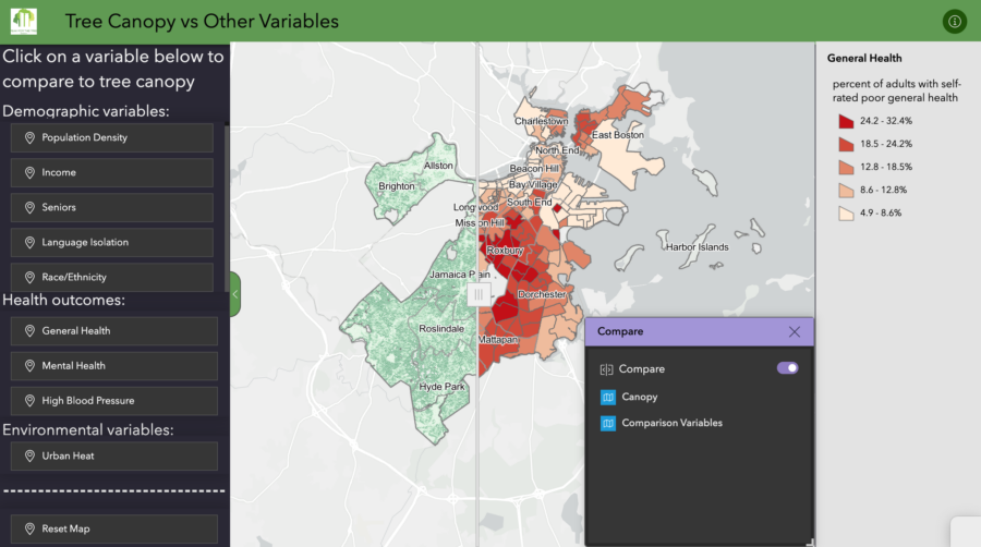
These maps were created by Chad Fisher, a graduate student at Tufts’ Agriculture, Food and Environment program. Chad was our summer 2023 Geospatial Analysis Fellow through the Tisch Summer Fellows program. Through these you can explore how trees, people, and the environment intersect across Boston. These maps are an update to a series of maps created by Raquel Jimenez in 2020 as part of her URBAN Program fellowship.
Tree Canopy in Boston
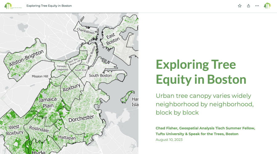
Exploring Tree Equity in Boston: urban tree canopy varies neighborhood by neighborhood, block by block. Launch this map.
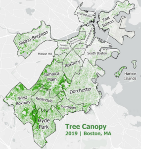
Many things make up urban spaces: buildings, parks, roads, rivers, and trees. One important way to support the health, resilience, and vitality of a city is through the trees in its urban forest (yes, it’s a forest!) We’ve created a story map that highlights where trees are found (and are missing) in the city. We invite you to use the map to zoom in and explore your neighborhood. We’ve created tools that allow you to examine Boston’s landscape on different scales, from the neighborhood scale down to the one-acre hexagon scale. The distribution of tree canopy coverage varies greatly across the city, but also varies greatly within specific neighborhoods. Where are there trees on your block ? Are they in parks? In streets? In yards?
If you’re looking for information on a specific street tree, please be sure to check out Boston’s street tree inventory map.
Boston’s Environment
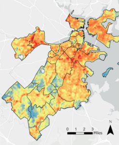
Average Annual Temperature (2021): land temperature from cool (blue) to hot (red). Launch this map.
Depending on their block or neighborhood, Boston residents encounter different climates. For example, some neighborhoods are hotter than others due to lower tree canopy and more roads and buildings. Neighborhoods with more concrete often have higher temperatures and are known as “heat islands.” You’ll notice how higher temperature areas tend to have less tree cover and how areas with more trees have better health outcomes.
Increasing tree cover is one way to reduce the severity of heat islands. Trees not only cast shade to reduce radiant energy, but they also serve as “air conditioners” by releasing water vapor and cooling entire blocks, not only during the day time, but also ensuring that neighborhoods stay cool at night, giving residents a chance to rest and recover from the day’s heat.
Residents’ Health
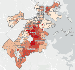
Boston Resident’s General Health: percent of adults with self-rated poor health varying from low (pale tan) to high (red). Launch this map.
In addition to improving the environment and cooling the air, trees have been shown to improve physical and mental health, relieve stress, and decrease blood pressure. Studies have also shown that trees can absorb air pollutants, decreasing rates of pulmonary disease and asthma. These are all factors that impact residents’ quality of life and life span.
With climate change, Boston is experiencing more extended periods of high temperatures, known as heat waves. Heat waves are a public health risk, leading to increased mortality and illness, especially among some of Boston’s most vulnerable populations.
You can explore the relationship between trees and health in the second section of our story map.
Boston’s People
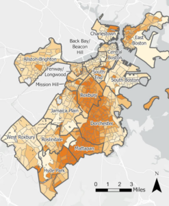
Explore demographic data from 2021, including percent minority, language isolation, income, and more.
Boston is a diverse city filled with people from all over the world. It is also a city segregated by race, background, and income. Our section on Boston’s People explores the relationship between tree canopy coverage and demographics in Boston. You can examine how different populations experience trees.
In our map we have tools that allow you to compare tree coverage to socioeconomic factors like income, percent minority, population density, and language isolation. These are among the criteria used by the Commonwealth of Massachusetts to define environmental justice neighborhoods.
What patterns do you notice? What factors make an area more or less likely to have high tree canopy coverage?
Tree Equity: Connecting people, environment, and trees
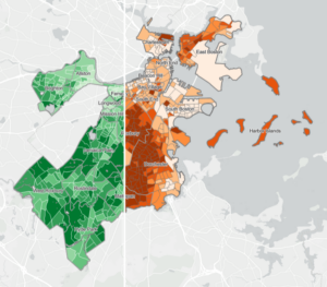
Tree Canopy vs. Minority Population: disinvestment in minority areas has and continues to lead to lower canopy in those areas. Launch the map.
Building tree equity means unpacking the inequity in our built environment, an inequity that can be traced to decades of systemic racist policies such as redlining, which led to disinvestment in certain neighborhoods. The results of these policies cast a long shadow, leading to a green line that often traces a historical red line. The legacy of this history is literally built into the concrete of cities across the country.
We invite you to explore the relationship between people, the environment, and trees, in Prioritizing Trees. In this section you can explore the relationship between redlining and tree canopy coverage. You can also spend time learning about the City of Boston’s priority zones, areas that the city is focusing its tree work on as part of its Urban Forest Plan. These priority zones take into account the environment (heat), tree canopy coverage, environmental justice communities, and historic factors (redlining.)
Additional Tools
We get it: sometimes a story map just feels like too much. We’ve created three tools that harness the power of data visualization and mapping to effectively spotlight disparities, provide tools for education and presentation, and drive informed decision-making.
Compare trees vs. heat
Interact with our swipe map tool below that visualizes local tree canopy data vs. urban heat metrics:
Explore trees vs. other factors
Click on the map below to compare demographic, health, and environmental variables to local tree canopy data (turn on the compare feature and select a variable on the left sidebar to use this feature):
Dive into Boston’s neighborhoods
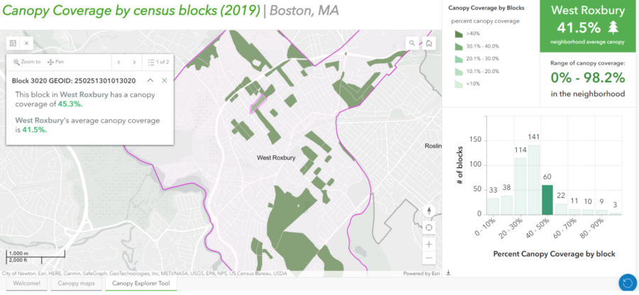
And examine tree canopy coverage in Boston with our Tree Canopy Explorer Tool. Follow the instructions on the main landing page to discover canopy distribution by census block that can show inequities not apparent at the neighborhood level:
A big thank you to Chad Fisher, our summer 2023 Tisch Geospatial Analysis Fellow and Dr. Raquel Jimenez Celsi and Boston University’s Graduate Program in Urban Biogeoscience & Environmental Health (URBAN).
